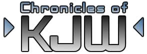
Did I mention I take requests? I liked the last suggestion that "anonymous" made so much that I decided to try it out. The small font over the large does look good, but I'm not sure about the arrows... They were an after thought anyway!
Keep those comments coming!


8 comments:
I like this one!!! It is very professional!!
Hmmm just as I thought....Kevbo yo a gen-i-ous!! looks sharp brotha!
looks awewome. you are good at this stuff!!
Thank you to everyone! Blogs are a great place to get your ideas out there, and I plan to do it more
I love this logo, I also Love to Lilac acres!! Thanks for walking the dogs!
#1 sista!
lookin' good, lookin' good...like the one on your monitor best!!!
check out this old Dovah BLOG, wonder why id didn't stay updated...
http://dovernh.blogspot.com/
That is strange... I know how hard it is to keep up a blog, maybe they just forgot about it!
Post a Comment